The following blog post originally appeared on the Curbed LA website on August 28, 2013.
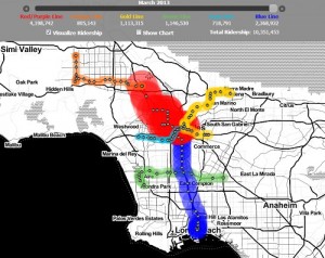
Metro ridership has been a popular theme among transit-loving hobbyist mappers, and here’s another neat one to add to the list. Lawrence Sim has taken Metro’s monthly rail ridership numbers since 2000 (plus the Orange Line busway) and plotted them on this handy dandy interactive map. It may not win any awards for special effects wizardry, but it’s neat to see how ridership has built steadily over time. Earlier reporting bears this out–in 2012 (when the Expo Line and Orange Line extension opened), ridership was up 12 percent over the previous year and 16 percent on the year before that. During that time, plain old bus ridership remained flat. Head over here to play with the map. · LA Metro ridership by month [Lawrenzo]

